Wednesday, October 16, 2013

10 Ways to Look Slimmer

This post is brought to you by optical illusions. 

Let's start with the basics which most of us know.

Dark colours slim you (think little black dress)
Light colours fatten (code for light colours attract attention)

Then the next one your mother probably didnt tell you. 

Stripes dont necessarily fatten.
Whether they fatten depends on their colour, their width, their placement & their direction.

ILLUSION #1: All over stripes

All over stripes can be surprisingly flattering for everyone. This is because the overall pattern causes the eye to move up & down rather than any stripe causing east-west eye movement.  

More so if there is a more dominant positive colour - here it's black. This is code for dark colours slim.


All over stripes with more negative (the lighter colour) space can still flatter, but not as much. 


ILLUSION #2: Half body stripes

Half body stripes can be dangerous. 

If you wear the stripes on half your body, instead of full length, there will be a fattening effect because there is less of a vertical line for the eye to move & the eye gets jolted/interrupted when the stripes finish & the other colour/pattern commences.

Also its safe to say that the wider the stripes the more likely they are to fatten. 


Stripes can take many forms in addition to the pattern on a fabric. ANYTHING which creates east-west eye movement is effectively a horizontal stripe.

ILLUSION #3: Coloured (or ombre) tiers

Horizontal tiers on a top (or a peasant skirt) are fattening. Not flattering.  


ILLUSION #4: Border prints

A horizontal border print will fatten the area that it sits over. 
So if your hips are big, I wouldnt suggest this peasant top. 


ILLUSION #5: Ruching

Horizontal gathers create east-west eye movement. If you have big hips, this is not the top for you. 


ILLUSION #6: Hem shape

A border with a horizontal line is more fattening than a border with a handkerchief hem.

In this photo, even the ribbing on the neckline can create
east-west eye movement as the scoop shape is quite deep.
If you want extra slim, go for a vee neck.  

Hanky hem - creates vertical eye movement (amongst the horizontal)
and is less fattening than a horizontal hem.


Not sure in what direction the stripes are working?
Do the blink test.
Face the garment (or mirror).
Close your eyes and clear your mind for 5 seconds. 
Then open your eyes.
The first place your eye travels, will be what is noticed first by anyone else. 


Doing the blink test will create a strong east-west movement over the tummy area.
Not good if you have a small bust & a large bottom half.


In this next photo, the brightest stripe is the turquoise around the waist, but the round turquoise band at the collar actually moves the eye upward toward the face, despite what's happening at the tummy. 

ILLUSION #7: Asymmetry slims

Asymmetrical details are great for interrupting horizontal lines.

The way the top is folded under at the hem is terrific for
breaking up the east-west eye movement created by the hem.

TIP: Asymmetry works beautifully when half tucking tops & shirts. See next two photos.


ILLUSION #8: Side vertical stripes

Even a vertical pattern on each side of the body can create
a sufficiently wide empty space between to cause the eye to move east-west. Not what we want unless we are super skinny. See next photo.  


In the next photo, the eye rests on the tummy where the white area expands. 
The black sides dont help to slim anything in this case.


In contrast, the dark side stripes in Stella McCartney's Octavia dress work miracles in the slimming department. 
Notice how the waist area is minimised with more indenting than the rest of the dress? Slimming gold. 


ILLUSION #9: Solo stripes

If the stripes are alone in a sea of plain fabric, the impact can be severe even if the width is small. Why? Because one stripe on a solid stands out far more than any stripe in a continuous pattern.


Blue top A creates vertical eye movement with the button placket. Then the eyes rest on the pockets/collar.

Pink top B is horribly east-west with that organza insert across the hip. 

Just for completeness, here is a top which is one of the best shapes for apples. Yes it has a vertical diamond pattern, but the genius here is that the "waist" band sits under the bust - which is the narrowest part of the body of an apple. This emphasis is super flattering. It also has a hanky hem at the sides for extra flattery (ie: the hanky shape breaks up the horizontal line of a straight hem). Everything works so well, that you dont even notice the straight line created by the black camisole. Its a great design. Basic, yes but clever. 


ILLUSION #9: Diagonal stripes

Diagonal stripes are often slimming simply because they cause the eye to move across the body. Buy not resting on a particular body part, it increases the chances that the eye wont rest on the wrong part. 

But diagonals can be tricky too. 
In this case, the eye movement is as per the pink arrow. 

Most people's vision goes from left to right. But the stripes drag the eye downward, in the south west direction. I wouldnt want the eye going straight to my hips. Would you?


In the next picture, the print acts as a stripe. The eye follows the print in a south easterly direction. All it manages to do is fatten the tummy area. 


ILLUSION #10: Navy can fatten

Finally, an example of where dark colours dont detract. In the following photo, the navy block with a horizontal waist & almost a horizontal hem jumps out from the yellow. It makes the hips look massive & makes them the first thing you notice. Flattering? Not too bad on our size 8 model. On a real girl, no way.


The moral here is even the rules of thumb wont always be 100% certain. The ultimate test of what works is the way you have put it together and the mirror is your best. Either that or post a photo on the Style into Action page & feedback. 


Sunday, October 13, 2013

Managing big boobs - lessons from Julie Bishop


When I saw this photo of Julie Bishop (Minister for Foreign Affairs) in New York on a United Nations junket, I got very excited because its a perfect example of what not to do if you have a big bust.

Oops. Big oops.

The high neckline just reinforces one big monoboob. There is nothing to break up the monoboob. No decolletage, no necklace, no brooch, no texture. Nothing.  

The monoboob walks into the room before Julie does. Distracting. Especially when you want to be taken seriously at the United Nations. Or anywhere. 

It doesnt help that its sleeveless - that provides even less to focus on, making the boobs the number one attraction. 

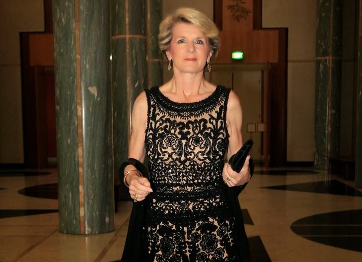
Here she is again at one of the polies' mid winter balls.


One big droopy monoboob.
Monoboob due to the high neckline.

Droopy because of the pattern/embroidery on the bodice. I doubt very much that she isnt wearing the right bra.
Eeewww.

But look at this one...


The scoop neckline helps to break up the monoboob. We notice the skin & the boobs start to take a back seat.

What about the next one? 


On one hand, I think she has lost some weight here, however it could be the fact that this is a matt dress compared to the scoop neck blingy silver number above. Shine reflects light & makes things look bigger. Matt absorbs light & makes things look smaller. I know which I prefer to wear. 

Weightloss or not, the big bust rule still applies. 
Big bust? Break it up.

So she breaks it up with a sheer layer with sequins/crystals. Nice.  

On a more subtle level, this also works well as it has some distinct straight lines - the broad collar line & the straight line of the lining above the bust. In contrast, the scoop neck blingy silver dress has a very obvious curved collar shape. Curves create curves. If you are already curvy be careful of adding curves with your clothes.

So let's go to Julie's work clothes. 
This next one isnt too bad....


The white cami has a somewhat high neckline. But she is breaking it up reasonably well with her Armani jacket & a brooch. The jacket works well here as the tweed provides texture & depth and the medium sized lapels balance out the chest area. 

Let's look at a variation of this....


Notice how simply by lowering the cami's neckline her boobs loose impact? Flick up & down between these two photos - the basic outfit is the same, but the impact of lowering the cami is massive. In the latter, you tend to then notice Julie as a whole rather than Julie's boobs.

Dont forget that there is still no sign of cleavage, its all very tasteful & the monoboob has been dissolved nicely. 


Friday, October 11, 2013

What's wrong here?

Here's the background:

A week or so ago SIA posted these photos of Sandra B & asked for opinions.


A dialogue ensued as follows:

Reader X: Love Sandy but this dress is just not doing it for me

Reader

Reader Z: Love this colour on her

Reader A: Does the fabric look a bit cheap?

Reader B: She looks amazing. Why so picky?


At that point, I replied that I would elaborate the following 

day:


SIA:  I see a few things wrong with this one...will explain tomorrow.

Reader C: Umm what? Hottest 49yo I've seen this week, give the poor bitch a break!


Ok then.....


Facebook hid Person C's comment & Person C continued 

with more colourful language which Facebook also hid. 


Person C has since stopped reading SIA's page and I 

wouldnt expect them to come back to 

read the page/this blog as that would be opening up old 

wounds for them. 


For everyone else though, here are SIA's thoughts on 

Sandy's look.


Sandra Bullock's colouring is such that she looks BEST in 

COOL colours. These are colours with blue undertones.

She looks WORST in WARM colours. These are colours 

with YELLOW undertones.


Best? This means colour in her cheeks, blemishes reduced, 

looks well rested.

Worst? This means under eye circles enhanced, blemishes 

magnified, washed out, pale, jaundiced.


I have come to this conclusion by studying many many 

photos of her in various colours. So even with varying 

lighting, varying make up & varying backgrounds, the 

conclusion is pretty consistent & easy to spot.


So she looks better with silver near her face compared to 

gold.


Now lets look at reds....

She looks better in bluey reds rather than orangey reds.

Blue reds include rose red, burgendy or rasberry.


This is burgendy & this was a US Vogue cover.

This is orangey-red.
& George Clooney

This one is hard to pick despite all the google photos.
My calculated guess is that its bluey-red.
Even though its not burgendy, its still a COOL shade. But only just. 

This is orangey red.

This was a Vogue US cover. Its Narciso Rodriguez &
the red is definitely blue-red.

This is also a bluey red.
Or a bluey-rose red. 
See this dress on Emma Stone? Its a blue red (rasberry) & 

its not a good shade for red heads (who tend to have warm 

complexions). But this shade is perfect for cool toned 

complexions like Sandra's.


  • Now lets move onto pinks....

    A fuchsia is a cool hot pink. It would be treat for Sandra. 


    But once you start to put some warmth into fuschia and 

    it turns into a magenta.Even though 

    magenta does have aspects of purple mixed into it, the 

    yellow tones are also quite distinct.


    The shade on Sandra looks like a magenta.

    It is not her best pinky-purple shade by a long shot.


    Now look at a gown worn by Diane Kruger. Diane also has 

    a cool toned complexion but with lighter colouring than 

    Sandra. 


    Diane's gown is a more toned down magenta. The fact 

    that its neckline is not as close to her face as Sandra's 

    helps to make it work. Also notice how its less intense than 

    Sandra's due to the shading of the ruffles. The moral here 

    is if you are going to wear the wrong colour, soften it & 

    lower it. So its not impacting your face as much. 

    Alternatively, put it on your bottom half or in an accessory 

    not near the face & it'll be perfect. 


    So what shade of purple is Sandra's best?

    By far the best is a royal purple - the colour you get when 

    you mix red & blue without a hint of yellow. 


    This is Bottega Veneta

    This is a Prabal Gurung

    If you like colour wheels (I do), then Sandy's best purple is 

    named purple in this wheel & what I am calling magenta is 

    in the quadrant called "red-purple". Notice how the "red-

    purple" gets warmer than the true purple?


    Issues apart from colour:


    Apart from colour, I also have a few comments to make 

    about the garment. 


    It's a really fine fabric - like a tissue silk. These are not very 

    forgiving because they are so thin. Its best if they have 

    elastene, but even then, its best of they are not used in 

    unforgiving areas. Like fitted around the bum & tummy. 


    Also look at the stitching on the ruffle...it doesnt look 

    smooth & fine & even. It looks rippled & cheap. Cheap. I 

    am sure its not, but it looks cheap.


    The hair? Sandra has a long face. hair down & straight, 

    with no bangs & without volume on the sides simply 

    emphasises that.


    In short, she can do better, both for colour & fit & hair. 

    I am not saying she doesnt look OK - but I dont rate others 

    on OK. I rate them on looking their personal best. For her, 

    this is not it.


    Comments welcome.