Showing posts with label contrast. Show all posts

Sunday, June 24, 2012

Ines de la Fresange - Checked shirt style

Ines de la Fresange  - ex Chanel muse & style icon, now designing for Roger Vivier.

Look at the ensemble she is wearing below - quite simple really.


Checked shirt with a toning oversized clutch
& a contrasting belt.

The things that make it modern are:

- the oversized clutch
- the belt placement

The things that make it unique to Ines are the jewellery:

- layered necklaces
- bracelet that looks like a stack of gold bangles
- Gucci watch with red accent which picks up the shirt colour
- a couple of small gold rings
- no earrings


Jewellery Style Tip:


If silver is a better metal for your complexion, then dont wear gold near your face. You dont have to mimic Ines piece for piece, just use her as inspiration but tailored for your unique features.


As for the shirt - well, it's seasonless. The belt is also seasonless, but the placement is totally 2012.

Shirt:

I found a very similar shirt at Sportscraft in plum. 


http://www.sportscraft.com.au/long-sleeve/sarah-gingham-oxford-shirt/w1/i11868911_1128119/


If you feel this is too "Pizza Hut tablecloth", then you can pick any of their other shirts & tone a clutch to it & contrast a belt.

Just keep the shirt style simple, a mens style, no frills, no large patterns, no bells & whistles.

Shirt Style Tip:
 
You can even do a white shirt - make sure its your best shade of white - starke, off white, cream. 

If you have toned arms, do short sleeves. 

I was in the Sportscraft store at Birkenhead Point, Sydney, yesterday & they had an amazing long sleeve B&W small polka dot cotton shirt which would have looked dynamite!
 

They actually do a checked shirt every season (I bought a cobalt blue check from them last winter).....


Belt:

Heaps of these around.....

All these are David Lawrence & could work a treat.....from top left, clockwise.....

red patent, 14mm wide, $40  
blue suede, 11 mm, $50
leopard, 17mm wide, $50
blue, with charm lock, 10 mm wide, $40 
blue, 9 mm wide $40


& this one from Sportscraft,
The style is called Monique, 15 mm width, available in this duck egg blue or a fuchsia or plum.

Waist Style Tip:

If you wanted to reduce attention from your waist, a toning colour belt would be best and that's why I have given you more options than just a contrast colour. If you tone the belt, then go for a contrast clutch for an element of pop.

Oversized Clutch:

Look at the leather of Ines' clutch - softest nappa & super expensive. Its a little tricky finding this on the Aussie high street.....

but maybe this will do....
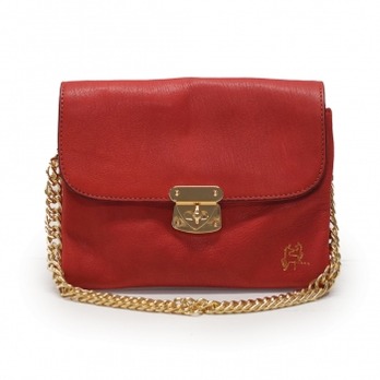
Its Tilka for $159 - you can remove the strap or leave it as is.

or this one....
which is a Peep Toe called Lady Fantasia, reduced from $249 to $174. make sure you Scotchgard this one!


Jewellery:

Go directly to Diva or Lovisa & select a few cheap & cheerful pieces to complete the look.

Bottom:

Denim or pants in white or navy or even a toning colour.

Sleeves Style Tip:

Roll up your sleeves for that effortless cool look & you're ready to go.

Your style:

Finally - this may not be your look. I'd call this almost preppy with a French twist. If you cringe at this look because you may be for example, a bohemian or a grunge or a bombshell style, then this definitely wont appeal. But I hope you have been able to take away a few style tips in any case.


Saturday, June 23, 2012

Woman of style - gorgeous mix of colour

Today I met another woman of style.
I was in the city and walking behind her.
I knew I'd regret it if I didnt tap her on the shoulder.

Her name was Youna.


She was wearing:

- a camel double faced coat
- grey stretch mini with gold zipped front skirt
- black coated leggins
- a black long scarf
- a tan tote
- grape-y/purple dessert boots

She looked fantastic.

I loved her use of colour - her basics of grey/black/soft camel were popped by tan & purple


Seriously, I have never seen desert boots look this good! Even the laces are a complementing shade of purple & help to give the look pop!


& the brighter tan of the tote worked beautifully against the neutrals. I am so glad she didnt match the softer coat colour to the tote colour.


Look at the coat - it has a cape over it.....

The cape is a great idea to broaden shoulders especially if you are a pear shape. Youna wasnt a pear, so in her case its just a terrific fashion feature as well as providing extra warmth around the shoulder area.


& it was double faced....what does this mean?

Well, double faced wool/cashmere is two layers of the fabric with a stretchable yarn

which serves as an intermediate to interlock 

between the stitches of the two layers of 

fabric. If that sounds clear as mud, here is a picture (showing a cross section of the fabric) which may help give you an idea of the fusion....


The edges of the fabric are folded in and there are no exposed raw edges. Garments with double faced fabric is extremely time consuming (& costly) to alter. Double faced wool/cashmere isnt usually lined. Double faced fabric can be used to create different effects on either side, or in Youna's case, to create a fabric that is identical inside & out.

I find its only the best garments that use fabric with this technique. Frankly, to have a fabric that is the same inside & out with no raw edges is lovely, clean & well, just yummy.


Leggins as pants


There (always) seems to be alot of debate about the use of leggins as pants. As far as I am concerned if you have legs like Youna's you can get away with alot more than a "normal" person. In any case, she is wearing the short mini over it. I think she rocks the look. What do you think?


So what more can I say?


She's gorgeous & she works a look to perfection.


Agree?


Friday, April 27, 2012

Black shoes do work with colourful dresses

A friend who is a Canberra (that's in Australia) stylist, Jane Allen said today that black shoes generally dont look right with colourful dresses. 

I totally understand where she is coming from. It makes lots of sense actually.

But I'd like to keep our options as open as possible & re-cast the statement as:

"Black shoes generally DO look right with colourful dresses AS LONG AS THE FOLLOWING CRITERIA ARE SATISFIED....."

So what are those criteria?....the easiest way to demonstrate is via photos.....


RULE: 

Black shoes will look great with a colourful outfit as long as there is sufficient black in the rest of the ensemble to visually link the shoes to the rest of the ensemble. 

Kind of like matching bag & shoes in my nanna's day, but not so matchy-matchy.

The shoes can visually go back to anything - bag, belt, bangles, necklaces, colours in the fabric or the lining, hair accessories etc. Anything.


Eye movement


Underlying the content of this post is the concept of eye movement - what this means is that when you look at a person, how does your eye move? Ideally if they are well dressed, your eye should move reasonably evenly up/down & end up at their face. If it stops and *&^%^#%#Y at the black shoes, then those shoes need a re-think. I have plenty of posts about eye movement - its one of my most preferred labels because it is such an important indicator of whether someone is well dressed.

NB: You should be doing the eye movement test on yourself in front of a full length mirror every day.


Blink test


If you are trying to work out the eye movement and you are very distracted - ie: your eye isnt calm enough to be able to decide where it wants to go, then the blink test is what you should do. I also have plenty of posts about the blink test - another of my fave labels.
Face the person, shut your eyes for 5 seconds & clear your mind. Then open your eyes, staring straight at them. Where did your eyes move? If they $%$(*&) at the black shoes, then its also time to re-think them.

Again, you can do the blink test for yourself in front of the mirror.
 

Witness:

Amanda Hearst on the right & Rose Byrne on the left in a Prabal Gurung fuschia number.


Amanda just doesnt have enough black for the shoes to go back to.

Rose does - in particular, the belt has sufficient width to mimic the width of the vamp on the shoe. It just works.


PS: Try to ignore the impact of the black carpet for Amanda  it makes her choice look even worse than it is....


Next, Camilla Belle - she links back the black solid pumps with a substantial belt. Score.


Again, Camilla Belle - yes I have a girl crush.


She gets it right with the sunnies, belt & pocket thingey (?).  Note also the shoes have straps & girly bows, so the belt stays thin & girly too. Now do you understand why I love this girl? 

Next, madam lash booties with wide "tough girl" belt. Even without the bag, this ensemble would work.


Fergie in a Christoforos Kotentos dress and jacket. The shoes go back to the black sections of the dress/jacket. Too easy.


Now, take a look at this - which do you prefer?


I hope you said the one on the left. The black colour of the shoes for the one on the right are just too out of touch for such a light floaty colourful dress.

Try to ignore shape differences in making your assessment - I am not trying to work out whether a pump looked better than a sandal or whether the frock fits better on one girl over the other.  For the purposes of this blog, just focus on the colour of the shoe. Having said, colour aside, a substantial pump may look out of place with a flimsy dress, but we'll cover that in another post!


Now take a look at Nicole Ritchie v Jennifer Aniston. Which shoe looks better? The gold/nude on Jen? or the black on Nicole? 


Did we all agree that Jen's shoe colour was better than Nicole's? I hope so! LOL!

Now look at the next three ladies.....the black shoes, as elegant as they are, look "off" with a glamour dress like that. Like her friends on the right, a lighter or brigher shoe would have been far more aesthetically pleasing.


The next one is a Victoria Beckham dress.
Firstly worn by Victoria - with a black shoe (small white trim) and a very boxy heavy VB bag. Before you give this one a score, scroll down....


to Olivia Palermo wearing the same dress.....


She understands that such a colourful number needs colourful accessories - banish the black.  Enter hot pink satin bag & animal pumps.

Gwyneth in a coral Calvin Klein with a neutral sandal & gold hard clutch.....


A black pump definitely would not have worked here. However she may have been able to get away with a very fine black sandal - only because the the black wasnt interfering with the coral/gold.

However, I dont know about you, but I dont like wearing something just because it doesnt interfere with other items I am wearing.I like to wear things things that go out of their way to enhance everything else I wear. So fine black sandal is out IMO.


Liv Tyler & Kate Winslet in Stella McCartney pull off black shoes because of the black scuba panel on the sides of their dress. Tick.


Finally, here is an interesting one - the coat & the tights stand out here - they are the highlights.

So why do the black shoes work? Because they go back to the black dress underneath the coat. The only other colour of dress that may have allowed the shoes to work is a dark grey/anthracite.


Enjoy.

Thursday, April 19, 2012

Cue inspired by Peter Pilotto

Cue inspired by Peter Pilotto

Look!

Cue AW 2012
(available around February 2012 & looks very summery!!)

The blue satin Ming dress $289AU


This was so successful, they re-cut it in a pink.

So its called the Pink Ming dress....


Now lets look at some of the pieces from the Peter Pilotto SS 2012 collection.

Note this collection was
shown on the runway in September 2011 - interesting timing compared to the Cue dress, eh?....

This one opened the show....

the pencil skirt version....


a pants version...
..adore the red shoe contrast......would you try this with the Cue dress? Why not?


a full skirt version......oooh, a floral shoe in toning yellows & greens....


Do you see some referencing? I do. Similar but not the same.

& the red.....adore this....too bad Cue didnt try to replicate it.....hot, hot, hot.


Here are some celebrities in Pilotto SS 2012.


Miranda Kerr


Amber Le Bon


Brooklyn Decker


Kate Bosworth

Carey Mulligan - love this colour on her


A bit of background on the label.....


The brand is the brainchild of
Christopher De Vos and Peter Pilotto who show at London Fashion Week.

The SS 2012 season had been inspired by a trip to Indonesia.
However they werent overflowing with the tropical prints you are seeing everywhere else.

Their core print, done in various colours gave the impression of under water views. Combined with
scuba suit referencing & sculptural pieces, it was like no other collection floating yet sexy, sharp and current. I loved the laser-cut pieces (I have only shown that in the red dress above).


Perhaps, who can blame Cue for being inspired??? perhaps....

& the shoes, oh my God, the shoes!!!!!

A collaboration with Nicholas Kirkwood, the Perspex-heeled, plastic flower-bedecked Pilotto shoes stand to be a big wish list item this season.

Friday, January 20, 2012

Colour, pattern & eye movement


This blog post is all about being able to make colour & pattern work for you to produce a more flattering YOU.


Fashion mantras

In order to get value from this blog post, you need to recall the following three fashion mantras:


1. Dark colours absorb light & make things look smaller; while light colours reflect light & make things look larger
.


2. If you want to look taller & slimmer, aim for your outfit to cause the viewer's eye to move upwards or up/down.


3. If you want to look fuller & shorter, aim for your outfit to cause the viewer's eye to move horizontally.


Eye movement


The eye moves in various directions due to placement, size and colour of seams, hems, sleeves, baubles, bling, stripes, zippers, buttons, size & scale of patterns - pretty much anything.


I came across some dresses recently which said "put me on the blog about colour & pattern placement. So here we go........

From a boutique in the Sydney CBD, the recent window:


Three similar dresses - but not the same - the placement of patterns and the colours gives a very different impact for each dress & each dress will flatter 3 very different shapes.

From left to right.....


Frock A


The colour above the waist brings the eye upward - always a win.

The large area of white below the waist makes the hip area seem larger. The is good if you have small hips & not so good if you have larger hips.

If you are wearing this, make sure that those sugary pinks & yellows suit your complexion.

Also check whether the "white" is true white or off white/cream. Most people will suit one or the other better - not both equally.


Frock B


The dark area above the waist makes her bust look smaller. Not a good look if you already have a small bust. Good if you have a larger bust, although ideally, large busts benefit more if they have lower scoop necks.

The flowers below the waist, in lighter colours, serve to emhasise the hips in comparison to the top area.

If you have fair skin, navy will be a better colour than black.


Frock C


The concentrated print at the waist brings attention to the waist.
But because the waist area is a darker colour than the rest of the frock, it makes the waist look extra small compared to the bust/hips. I'd say this is a good thing for most girlies!

Since the flowers are spread evenly at both top AND bottom, this dress has the most potential to suit most shapes.

The belt colour tones in with the flowers, so provides definition, but isnt so strong that it causes the eye to move horizontally.......


OVERALL RESULT:


It really does depend on whether you are bottom heavy, top heavy or evenly proportioned as to which dress is best.

The thing that stood out for me though, was Dress C moved the eye up & down very nicely. The other two dresses tended to move the horizontally.


Stella dress in Myer

Unless you are super skinny & need fattening up, this Stella dress is a disaster as far as eye movement is concerned. The eye moves horizontally with the flowers at the bust, then it hops down and moves horizontally at the hem. Its not even a smooth movement to the hem...its a jump.......Eeeeeewwwww. Who wants a dress where the eye ends up at the hem & makes you look fat? Not me.


Web dress D - unknown designer

This one still has a horizontal seam at the waist, but its more subtle than Stella (no garden at the waist). Plus it has the vertical buttons. So the eye still vertically and downward toward the flower garden. Even if it has a horizontal neckline, its till much better than Stella.


Web dress E - unknown designer

As far as seams go, this is better still, as there are no horizontal seams.....so its more up & down than dress D and Stella.
However it makes the girl look a tad solid through the waist as the background in that area is white. If they had started the black background a tad higher, it would have slimmed her waist even more and been better.


Web dress F - unknown designer

How do I love thee?
Let me count the ways......


a) The black background has started at the waist.


b) The border isnt heavy handed in the horizontal direction & has quite a vertical lift


c) The pleat-y things at the front literally provide a vertical road map better than any GPS.


d) The deep vee neck also moved the eye up & down.


Frock G
- from Portmans in Rouse Hill

It was perfect for this blog post, so I snapped it.


a) Darker background in the middle whittling away the waist Even though a larger pattern normally makes the body look larger, the dark background corrects this perfectly

b) Toning belt to highlight waist but not but the girl in half and break our eye movement


c) Medium size pattern on top & bottom, so as not to make them look larger than life


d) Lighter background on top - great if you have small bust


e) Medium background on bottom - great to minimise large hips